MY BLOG HAS RAN OUT OF SPACE SO PLEASE FOLLOW THE CONTINUATION OF THIS BLOG THROUGH THE LINK ON THE LINK LIST AT THE SIDE:
DESIGN CONTEXT 2
Tuesday 28 December 2010
Friday 10 December 2010
Monday 6 December 2010
My three words- imagery
I'm looking at immediate imagery associated with my three words to hopefully kick start some ideas for my videos. I'm going to do some quick drawings for ideas after this.
Disperse


Flip


Extend


Disperse


Flip

Extend


Saturday 4 December 2010
I love this video! I like the use of black and white only, this is similar to the brief that we have been given which limits us to black and white and one other colour only. It has a feel of an old film with the grainy screen and the flickers. I love hoe busy it is and how so much is introduced.
Flickermood 2.0 from Sebastian Lange on Vimeo.
Flickermood 2.0 from Sebastian Lange on Vimeo.
Friday 3 December 2010
Trainspotting
This has elements in it which I find interesting for my word flip. There are small, fast parts of the sequence which are subtle but flip an object 90degrees to change position of something. I also like how they have used layering, laying an object on top of another to create another image or bring in more text.
Trainspotting from Yang-Hsin,Chen on Vimeo.
Trainspotting from Yang-Hsin,Chen on Vimeo.
Thursday 2 December 2010
Fringe
Towards the end of this sequence when the letters come together from broken up pieces, I really like this idea and how it appears to take longer towards the end of the word to complete the letters. I also like how the style of it makes it seem like the camera is zooming out or moving backwards on everything.
Type
Type. from Rémi Cabarrou on Vimeo.
I like how the use of type is subtle, there is nothing major going on just the introduction of a lot of different type and different fonts and sizes. I like how things are faded behind each other repeating words and the subtle shakes of words. This makes me think that it doesn't have to be really complicated and busy to be effective animation.
Typography
I like the idea of things coming out of each other, type coming out of objects, objects forming letters within a word and words springing from others and other objects. I really like how this is so interactive and you have to watch intensely to take it all in.
Tuesday 30 November 2010
Tuesday 23 November 2010


Friday 12 November 2010
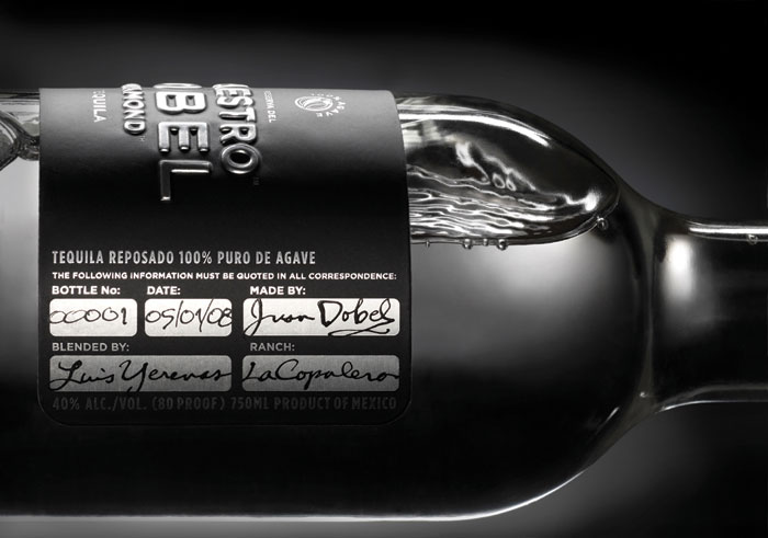
Drink labels


"Product labels are an essential part of the whole marketing exercise: they communicate important information about the stored item and also help in branding efforts for a company. However, these labels are lost on the blind for obvious reasons. This is why Baud decided to incorporate Braille in designing the package and label for Lazarus Wine.
The bottle itself makes for a brilliant design and the label is made intelligible for the sightless with Braille inscriptions. The whole manufacturing process is highlighted by the engravings. The beauty of the bottle is not lost on the general public either with the usage of bright colors.
Font used: BRAILLE"

From WarDesign site: Imagine being briefed to create striking packaging for a product named after the height of the bottle it's packaged in. With only smallp rint runs required, there was a really opportunity to have some fun. The solution was to design labels that were also 12" long, printed onto packaging tape using different colours to identify different variants. The labels wrap around the bottle creating a powerful and memorable branding device.
It sounds pretty obvious but it's something that I've just thought about when looking at this, to slightly change the colour on the label whether it be the type or logo etc to differentiate what each bottle is.


The Oggau Estate is a new wine growing estate that produces 9 wines with different characters. Each wine has its own individual character with its own story and complex, changing relationships. A wine family comprising of grandparents, parents and children with intrigue, secret affairs, arguments, colourful characters and the odd black sheep. A typical family clan.
With all of these designs I am focusing on how they work together to create a range and how there is a continuity throughout all products, something that I must keep in mind when linking the drinks labels to the food packages, they must connect in some way to portray a range to the consumers.
Drink labels


The Triennale Design Museum, presented "Message on the bottle", a project of OnDesign, the design and communication agency headed by the Italian-German designer duo Francalma Nieddu and Olav Jünke. They invited their designer friends around the world to put a personal message on the bottle as a label or in any form they liked. The resulting works had been presented to the public at the Triennale DesignCafè in Milan on bottles of biodynamically grown Barbera and gave wines from Piedmont's La Raia wine cellar, after winning a European Design Award in Stockholm with their "wine for you" design, an emblem of the exibiion. The design is a modern reinterpretation of the message in a bottle theme, featuring not a letter, but a fine wine.
In "Chi guida non beve, chi beve non guida" project, a ribbon is softly winded around the bottle and quote the slogan "Drivers don't drink, drinkers don't drive".
Thursday 11 November 2010


Saturday 6 November 2010
Gold foil block


"This foil blocked wine label was designed as a nod to the luxury and festive atmosphere of Saint Tropez."
Friday 5 November 2010
Moonstruck Chocolate Co.


Alton Brown


Embossed logos


I like that there is nothing more needed other than the embossed title or slogan it works by itself. This is why I am hoping to keep my logo simplistic because it works well simply by the effect.


Caligo- drink labels


Wednesday 3 November 2010


Subscribe to:
Posts (Atom)